

Beeswarm – an HTML Tool using Python
Accepting the challenge to build an HTML tool in Alteryx (in my case, with the Python engine), I settled for something I’ve been missing from the reporting tools (even with the added Plotly features):
A simple way to create a swarmplot. I was hoping to be using the PyBeeswarm module, that offered multiple ways of jittering the data, but it seems to not be updated anymore so, instead, created a wrapper for seaborn.swarmplot, which, additionally, allows for an overlay with violin plots or box plots.
The packaged tool is here (.yxi installer) and a sample workflow here.

Bringing the tool to the canvas, connecting it to the data stream and running the workflow once (so that the tool becomes aware of the fields available upstream) will bring the configuration window with the options to configure.
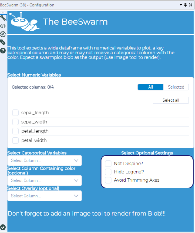
- Required items:
- At least one numeric measure
- Optional:
- Other measures.
- One categorical variable to split the dots.
- A column to specify the color.
- Settings for the graph (Despine or not – and then trim it or not, Show/Hide Legends).
- Select overlay: None, Boxplot, Violinplot.
Swarmplot without color source
When a column with the color information is not provided, colors are assigned randomly.
The current version doesn’t accept a color column when no key is added (it will color the different measures randomly).
Swarmplot with a color source
Colors are assigned as specified

Thanks for reading!